문제 주어진 코드를 이용하여 창의 넓이에 따라 사진의 갯수를 다르게 출력하시오.
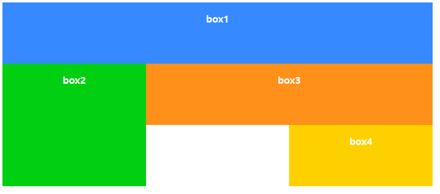
▶ 변경 전 화면
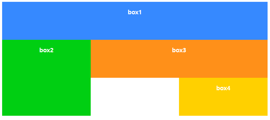
▶ 변경 후 화면
코드 #wrapper {
display: grid;
grid-template-columns: repeat(auto-fit, minmax(250px, 1fr));
}
auto-fit을 이용하여 화면에 이미지 카드를 가득 채운다.
전체 코드 <!DOCTYPE html>
<html lang="en">
<head>
<meta charset="UTF-8">
<meta name="viewport" content="width=device-width, initial-scale=1">
<title>상품 갤러리 만들기</title>
<style>
* {
box-sizing: border-box;
}
body {
background-color:#eee;
font-size:16px;
}
    #wrapper {
      display: grid;
      grid-template-columns: repeat(auto-fit, minmax(250px, 1fr));
    }
.card {
background-color:#fff;
box-shadow:0px 1px 5px #222;
}
.card > header {
font-size:1.5rem;
padding:0.5rem;
}
.card > p {
padding:0.5rem;
line-height:1.6em;
}
img {
max-width:100%;
}
</style>
</head>
<body>
<div id="wrapper">
<div class="card">
<header>
<h3>사진 제목</h3>
</header>
<figure>
<img src="../imagesCup/cup-1.jpg">
</figure>
<p>사진 설명 : Lorem ipsum dolor sit amet, consectetur adipisicing elit. Ullam, numquam. Neque mollitia esse blanditiis facere.</p>
</div>
<div class="card">
<header>
<h3>사진 제목</h3>
</header>
<figure>
<img src="../imagesCup/cup-2.jpg">
</figure>
<p>사진 설명 : Lorem ipsum dolor sit amet, consectetur adipisicing elit. Ullam, numquam. Neque mollitia esse blanditiis facere.</p>
</div>
<div class="card">
<header>
<h3>사진 제목</h3>
</header>
<figure>
<img src="../imagesCup/cup-3.jpg">
</figure>
<p>사진 설명 : Lorem ipsum dolor sit amet, consectetur adipisicing elit. Ullam, numquam. Neque mollitia esse blanditiis facere.</p>
</div>
<div class="card">
<header>
<h3>사진 제목</h3>
</header>
<figure>
<img src="../imagesCup/cup-4.jpg">
</figure>
<p>사진 설명 : Lorem ipsum dolor sit amet, consectetur adipisicing elit. Ullam, numquam. Neque mollitia esse blanditiis facere.</p>
</div>
<div class="card">
<header>
<h3>사진 제목</h3>
</header>
<figure>
<img src="../imagesCup/cup-5.jpg">
</figure>
<p>사진 설명 : Lorem ipsum dolor sit amet, consectetur adipisicing elit. Ullam, numquam. Neque mollitia esse blanditiis facere.</p>
</div>
<div class="card">
<header>
<h3>사진 제목</h3>
</header>
<figure>
<img src="../imagesCup/cup-6.jpg">
</figure>
<p>사진 설명 : Lorem ipsum dolor sit amet, consectetur adipisicing elit. Ullam, numquam. Neque mollitia esse blanditiis facere.</p>
</div>
<div class="card">
<header>
<h3>사진 제목</h3>
</header>
<figure>
<img src="../imagesCup/cup-7.jpg">
</figure>
<p>사진 설명 : Lorem ipsum dolor sit amet, consectetur adipisicing elit. Ullam, numquam. Neque mollitia esse blanditiis facere.</p>
</div>
<div class="card">
<header>
<h3>사진 제목</h3>
</header>
<figure>
<img src="../imagesCup/cup-8.jpg">
</figure>
<p>사진 설명 : Lorem ipsum dolor sit amet, consectetur adipisicing elit. Ullam, numquam. Neque mollitia esse blanditiis facere.</p>
</div>
</div>
</body>
</html>