728x90
반응형
문제 1
그리드를 이용하여 해당 화면을 출력하는 코드를 작성하시오.
▶ 코드
<!DOCTYPE html>
<html lang="ko">
<head>
  <meta charset="UTF-8">
  <meta name="viewport" content="width=device-width, initial-scale=1">
  <title>CSS Grid Layout</title>
  <style>
    #wrapper{
      width:700px;
      display:grid;
      grid-template-columns:repeat(3, 1fr);
      grid-template-rows:repeat(3, 100px);
    }
    .box{
      padding:15px;
      color:#fff;
      font-weight:bold;
      text-align:center;
    }
    .box1 {
      background-color:#3689ff;
      grid-column: 1/4;
      /* 1부터 4까지 */
    }
    .box2 {
      background-color:#00cf12;
      grid-column-start: 1;
      grid-row: 2/4;
    }
    .box3 {
      background-color:#ff9019;
      grid-column: 2/4;
    }
    .box4 {
      background-color:#ffd000;
      grid-column-start: 3;
    }
  </style>
</head>
<body>
  <div id="wrapper">
    <div class="box box1">box1</div>
    <div class="box box2">box2</div>
    <div class="box box3">box3</div>
    <div class="box box4">box4</div>
  </div>
</body>
</html>
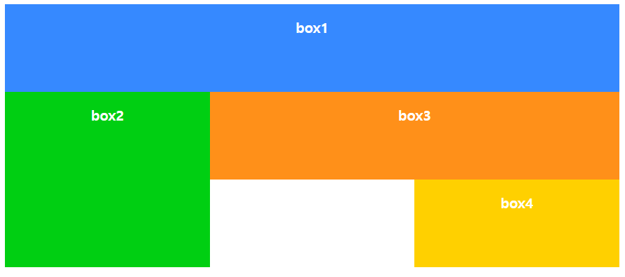
문제 2
그리드를 이용하여 해당 화면을 출력하는 코드를 작성하시오.

▶ 코드
<!DOCTYPE html>
<html lang="ko">
<head>
  <meta charset="UTF-8">
  <meta name="viewport" content="width=device-width, initial-scale=1">
  <title>CSS Grid Layout</title>
  <style>
    #wrapper{
      width:700px;
      display:grid;
      grid-template-columns:repeat(3, 1fr);
      grid-template-rows:repeat(3, 100px);
    }
    .box{
      padding:15px;
      color:#fff;
      font-weight:bold;
      text-align:center;
    }
    .box1 {
      background-color:#3689ff;
      grid-column: 1/3;
    }
    .box2 {
      background-color:#00cf12;
      grid-column-start: 1;
      grid-row: 2/4;
    }
    .box3 {
      background-color:#ff9019;
      grid-column: 3/4;
    }
    .box4 {
      background-color:#ffd000;
      grid-column-start: 3;
      grid-row: 2/4;
    }
  </style>
</head>
<body>
  <div id="wrapper">
    <div class="box box1">box1</div>
    <div class="box box2">box2</div>
    <div class="box box3">box3</div>
    <div class="box box4">box4</div>
  </div>
</body>
</html>
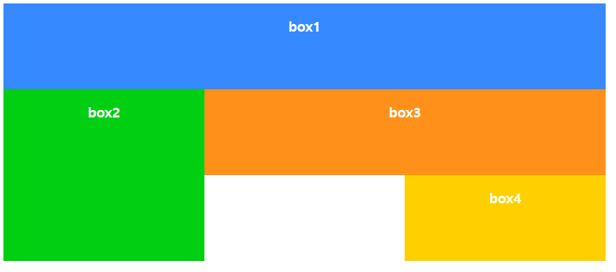
문제 3
그리드의 area를 이용하여 해당 화면을 출력하는 코드를 작성하시오.
<!DOCTYPE html>
<html lang="ko">
<head>
  <meta charset="UTF-8">
  <meta name="viewport" content="width=device-width, initial-scale=1">
  <title>CSS Grid Layout</title>
  <style>
    #wrapper{
      width:700px;
      display:grid;
      grid-template-columns:repeat(3, 1fr);
      grid-template-rows:repeat(3, 100px);
      grid-template-areas:
        "box1 box1 box1"
        "box2 box3 box3"
        "box2 . box4"
      ;
      /* "box1 box1 box1"
      명시적으로 박스 위치를 나타낼 수 있다. */
    }
    .box{
      padding:15px;
      color:#fff;
      font-weight:bold;
      text-align:center;
    }
    .box1 {
      background-color:#3689ff;
      grid-area: box1;
      /* 클래스의 이름이 아닌 grid-area: 의 이름을 사용한다. */
    }
    .box2 {
      background-color:#00cf12;
      grid-area: box2;
    }
    .box3 {
      background-color:#ff9019;
      grid-area: box3;
    }
    .box4 {
      background-color:#ffd000;
      grid-area: box4;
    }
  </style>
</head>
<body>
  <div id="wrapper">
    <div class="box box1">box1</div>
    <div class="box box2">box2</div>
    <div class="box box3">box3</div>
    <div class="box box4">box4</div>
  </div>
</body>
</html>
728x90
반응형
'HRD_훈련 > 실습' 카테고리의 다른 글
| [JavaScript] time 실습 (31일차) (0) | 2023.06.28 |
|---|---|
| [JavaScript] 배수의 개수 구하기 (31일차) (0) | 2023.06.28 |
| [CSS] 미디어 쿼리 실습 (30일차) (0) | 2023.06.27 |
| [CSS] 프롬포트 실습 (29일차) (0) | 2023.06.26 |
| [CSS] 선택자 실습 (29일차) (0) | 2023.06.26 |